
Nava’s vision is to build a world in which simple, effective, and accessible government services continually earn the public’s trust. While we’ve been working towards this since our founding in 2015, Nava has changed a lot. We have grown from a small team to more than 250 people working with federal, state, and local government agencies on projects that serve millions of people every day.
As we've grown, it has become clear that our brand needed to evolve to act as a central, unifying force through which our vision, culture, and values could all be represented.
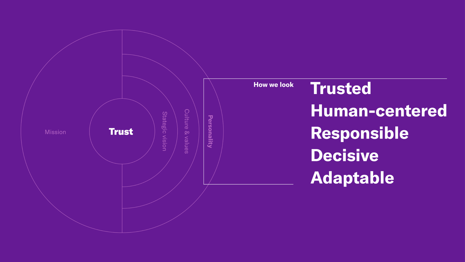
Trust at the center
Earning trust is not easy. Building it takes time, but it enables us to do the work we set out to do: unlocking transformative change for the government programs we care about. Which is why at the core of our new brand is trust.
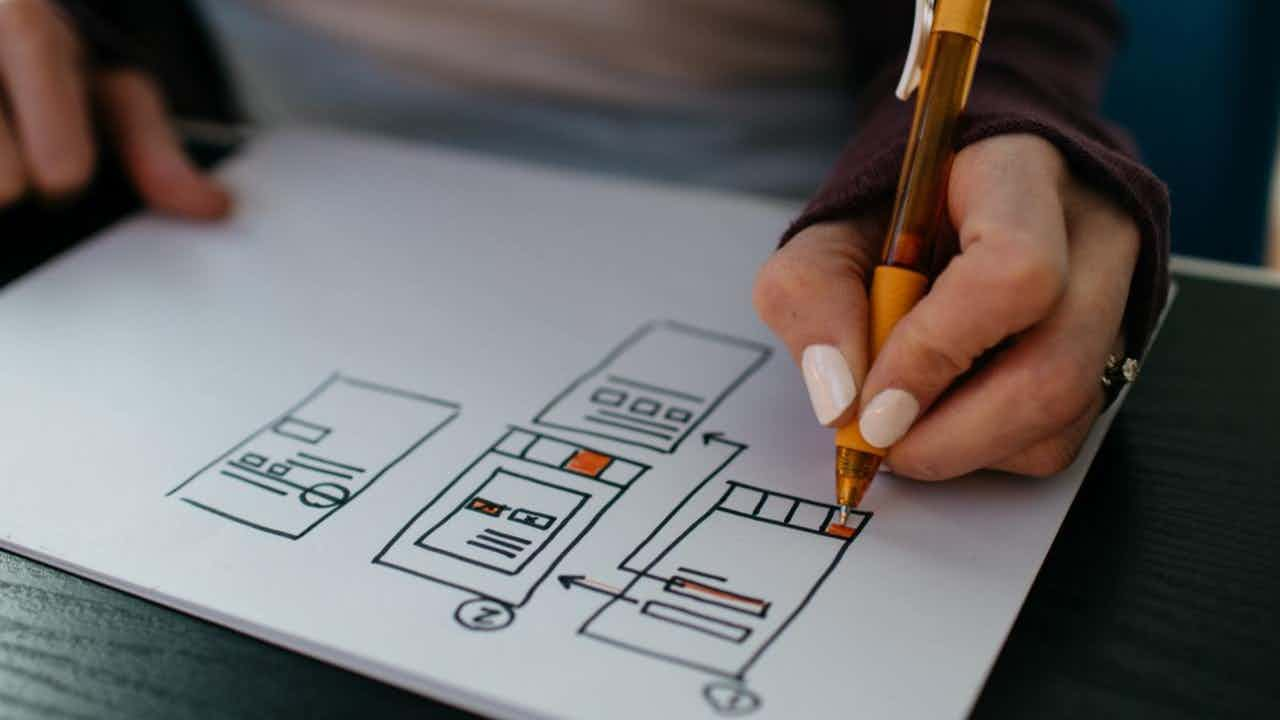
Building a new visual identity
We’ve built our new look and feel from our values and following foundational characteristics:
Trusted
Human-centered
Responsible
Decisive
Adaptable
Nava’s brand strategy and characteristics have acted as a north star during the development process. Here are some of the new changes you will see reflected in our visual identity system.
Logotype
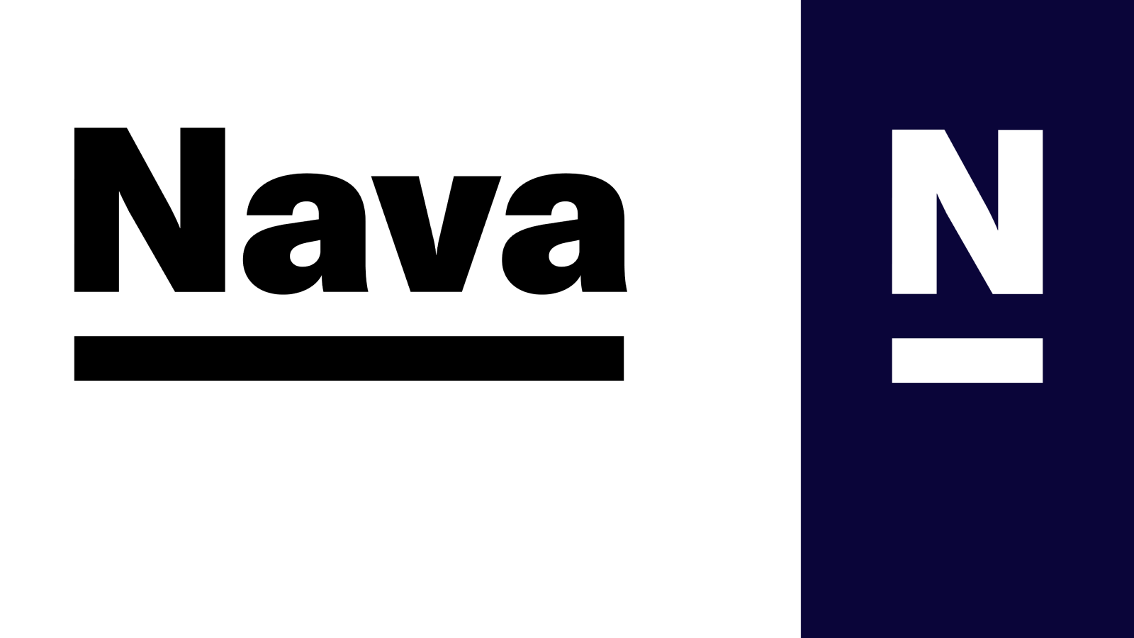
Our new logotype is similar to our previous one, but instead of all capitals, it now uses upper and lowercase letterforms in order to appear a little more friendly and approachable. The underline beneath the letter N is intended to connote foundations and structure.
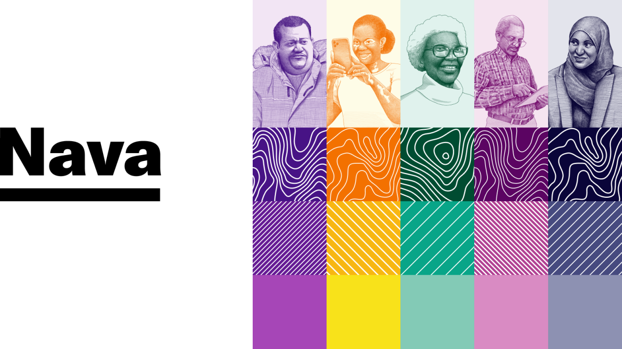
Brand colors
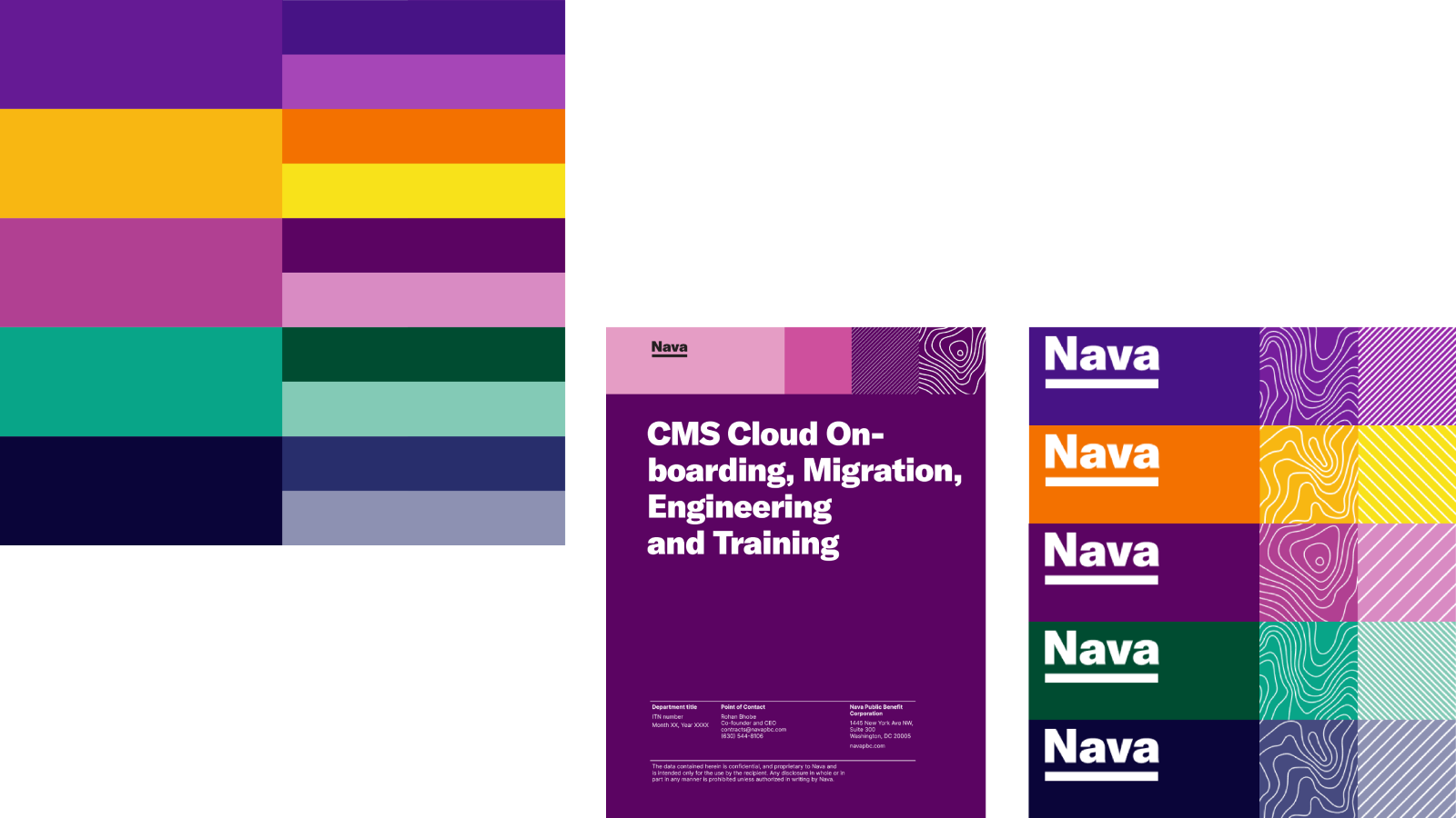
Nava is represented by a flexible, interchangeable set of five primary colors, with their light and dark accents. This is an intentional attempt to represent diversity and adaptability.
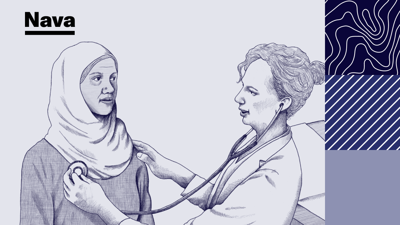
Imagery
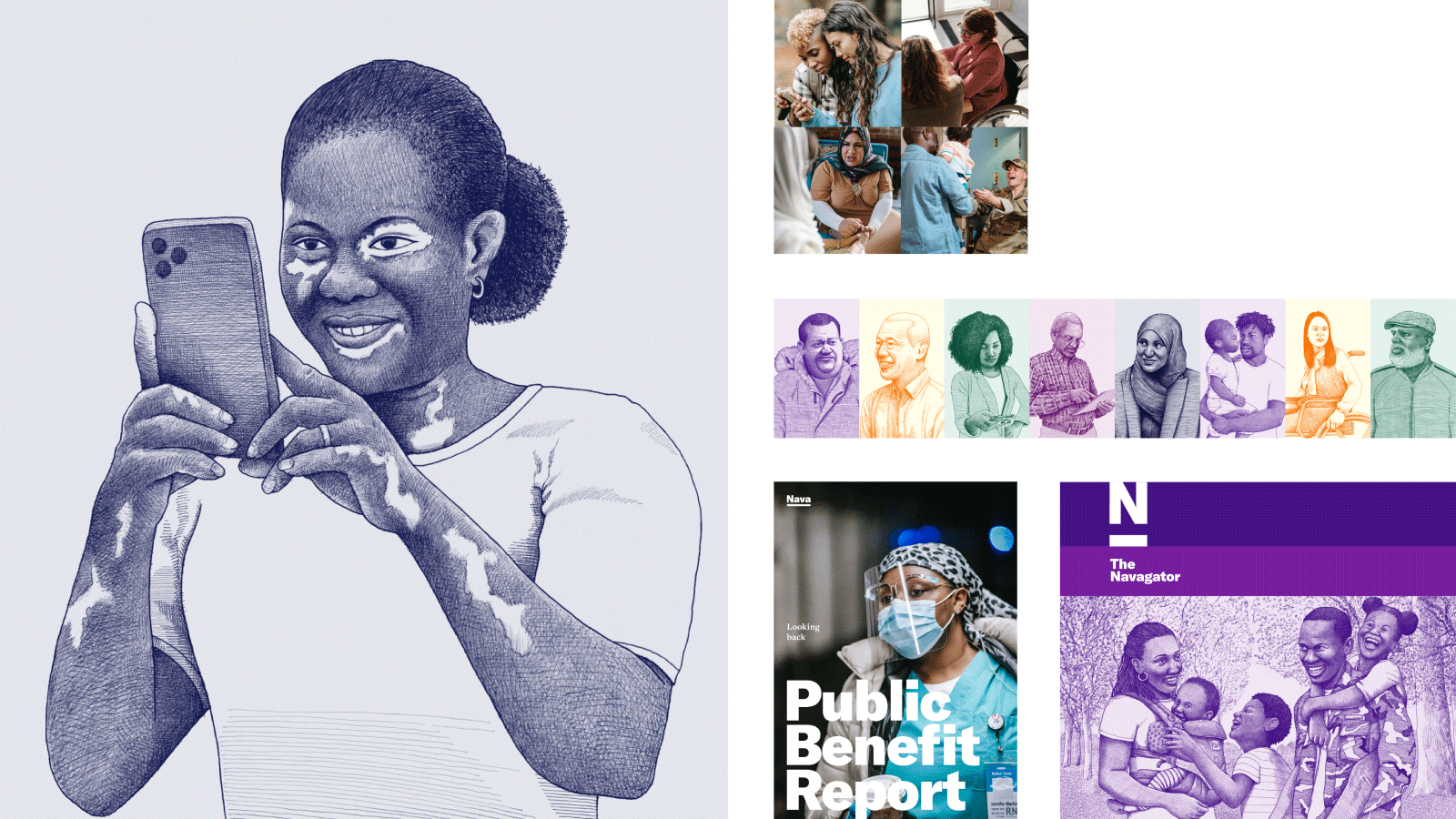
Illustration is now an integral part of Nava’s brand and communicates our human-centered characteristic. Rather than a support element, it is a core aspect of our brand that emphasizes the need for public institutions to earn trust by quickly and effectively responding to people’s needs. These illustrations portray a wide range of people from all walks of life, reflecting not only the people Nava serves but who we are as a public benefit corporation. Nava’s series of brand illustrations are specially commissioned and have a unified look and feel. They show a sense of humanity through a journalistic, almost photo-realistic approach to illustration. They are intentionally imperfect, revealing the hand of the illustrator, Sam Piyasena (Billie J). Sam’s expressive line work also visually connects with other brand elements that use map-like contours.
As Nava grows and the brand progresses, we will keep adding to the illustration library, bringing in different genders, ethnicities, faiths, ages, sizes, and people with disabilities to be used across our communications.
A flexible design system
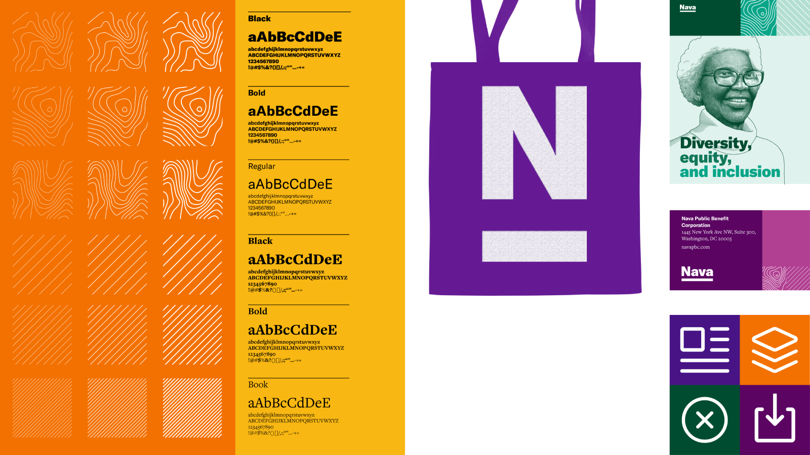
The logo, color system and imagery are all key components in our larger design system. It’s a system that also supports:
New contrasting sans and serif typefaces: GT America and Freight Text Pro.
A series of brand patterns that represent navigating through different landscapes. Nava’s work is not all straight-forward, but can be both simple and complex. The terrain patterns represent “responsiveness” and “adaptability”, laddering back to two of Nava’s brand characteristics.
A set of icons that work harmoniously with other brand elements.
What’s next?
We are incredibly excited to roll out our new brand and believe it is a more authentic and accurate representation of who we are. We’re also far from finished – we’re applying an iterative approach to the brand in the same way as we build technology for our clients, collecting feedback, looking at trends, seeing what works and what doesn’t work and then feeding this back into the brand’s development. It will change and evolve as Nava changes and evolves, reflecting who we are, who we serve, and what we stand for.