Nava worked with the Centers for Medicare & Medicaid Services (CMS) to create an open source design system for HealthCare.gov.
Some of the bigger technical decisions we made while building that design system were informed by the work of people who've done similar work before us. Lots of smart folks have already put a lot of thought into the best approaches for building scalable, developer-friendly, and flexible design systems. This post will shine a light on the resources we used to help steer the technical direction.
Architecture
Sass and React
Much of the HealthCare.gov front-end, and especially new work underway, is built in Sass and React. In addition, most 18F projects and the U.S. Web Design Standards use Sass. These were important factors to us when considering what to use in order to provide the widest range of support. We’re able to use the same stylelint rules as 18F to ensure consistent code standards, the same Sass variables as the Standards to ensure color palettes are consistent, and if developers want to, they can import individual components for a smaller bundle size.
Code conventions
A lot of the design system’s architecture and naming convention was inspired by a post written by Brad Frost: CSS Architecture for Design Systems. A guiding principle for how we name things came directly from his post:
The design system may sometimes seem verbose, but it delivers clarity and resilience in exchange. Keeping CSS legible and scalable means sacrificing a shorter syntax.
We follow much of what Brad lays out in his post. We follow an ITCSS architecture, and our CSS classes include a namespace, prefix, and BEM syntax. This can result in lengthy class names, but we prefer this for its legibility and predictability. Here’s what this looks like in practice:
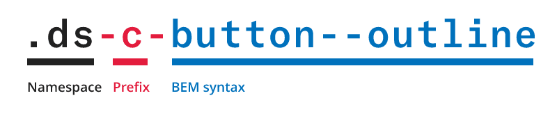
This is the design system’s CSS class naming convention.
We namespace CSS class names to avoid conflicting with other libraries and existing code. This is important for implementation on HealthCare.gov, as it allows us to incrementally apply the design system to existing parts without introducing unintended side effects.
Prefixes are added to make it more apparent what job the class is doing. A prefix of c- indicates a component class, u- indicates a utility class, and l- indicates a layout-related class.
BEM syntax follows the namespace and prefix. It’s a methodology that’s widely known, resembles the syntax used by the U.S. Web Design Standards, and works well for modular CSS.
Helpful CSS architecture resources
Documentation
An exercise we did during the early stages was review the landscape of frameworks and tools available for documenting design systems. We experimented with some of the more popular ones like Fractal, Pattern Lab, React Storybook, and Catalog.
The requirements we measured these tools against were:
It should output a static HTML site. This would allow us to archive each version of the documentation so it’s still available for teams using older releases.
It should be easily customizable. The documentation is public, so it should be easy to brand and make our own.
It should output examples and code snippets for both HTML and React components.
It should be actively maintained and have successful case studies.
Generating documentation
The tool we ultimately landed on for building the documentation was KSS (Knyle Style Sheets). With KSS, you write documentation as CSS comment blocks that conform to the KSS spec. You then run a command to parse the comments and generate a documentation site from them.
There were several things we liked about this setup:
We knew it would be a lot of work to develop both the design system and a documentation site simultaneously. KSS allowed us to document things directly within the CSS files as we went along.
KSS has a JavaScript API, which gives us a JSON representation of the documentation. We integrated this into our Gulp build process to further customize the generated documentation. Some customizations included adding EJS syntax support to the markup examples and extending the KSS spec to support “custom flags”, which get parsed as separate JSON properties. These custom flags are used to indicate the status of a component (alpha, beta, ready) and to link to the related pattern in the U.S. Web Design Standards. For example:
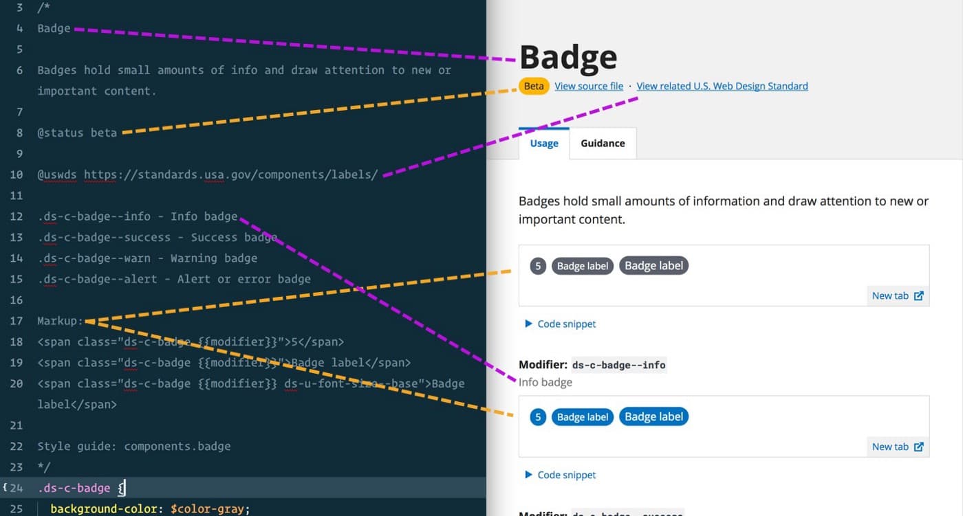
This is a CSS comment block that gets generated into a documentation page using KSS.
React components are also documented using inline comments, and we use react-docgen to enable this. The output returned by react-docgen is then merged with KSS’s JSON. The JSON representation of each page is then passed into a React app as props and rendered as a static HTML page using ReactDOMServer.
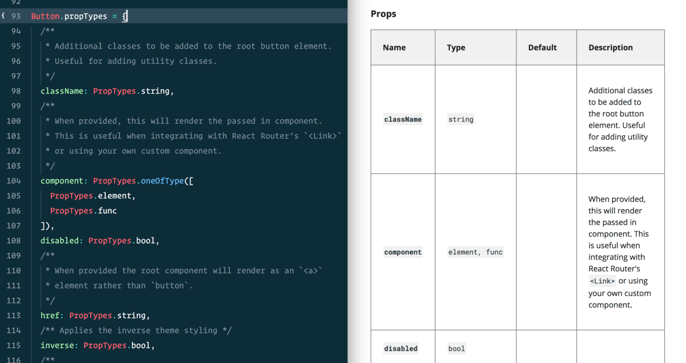
JS comments within a React component’s propTypes definition are used to generate the component’s documentation.
Developer workflow
An interesting local development workflow is unlocked when you combine this idea of inline documentation with live browser reloading. For the live reloading side of things, we’re using a combo of Browsersync and Webpack’s Hot Module Replacement.
You can have your code editor side-by-side with your web browser and see the documentation page for a component take shape as you edit a single file:
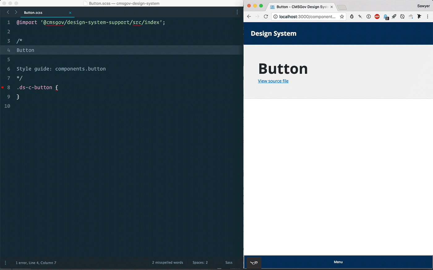
Building a documentation page by editing a single CSS file.
Responsive previews
Taking this a step further, some markup examples within the documentation include the option to toggle between different breakpoints. This is useful for testing the responsiveness of components. For example, the grid framework includes classes that only kick in at certain breakpoints, allowing you to control the number of columns an element spans at different viewport widths.
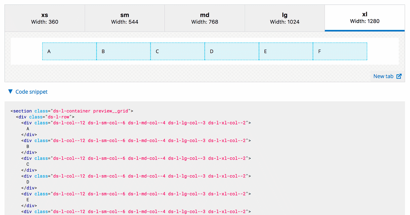
Previewing grid markup at different breakpoints.
Tracking performance and maintainability
Another area of the local dev workflow we’ve experimented with is how we surface stats that relate to performance, maintainability, and consistency. One way we’ve done this is through integrating the CSSStats Node package into our Gulp build process. We then present these stats in a table, comparing them against the latest public release in the master branch:
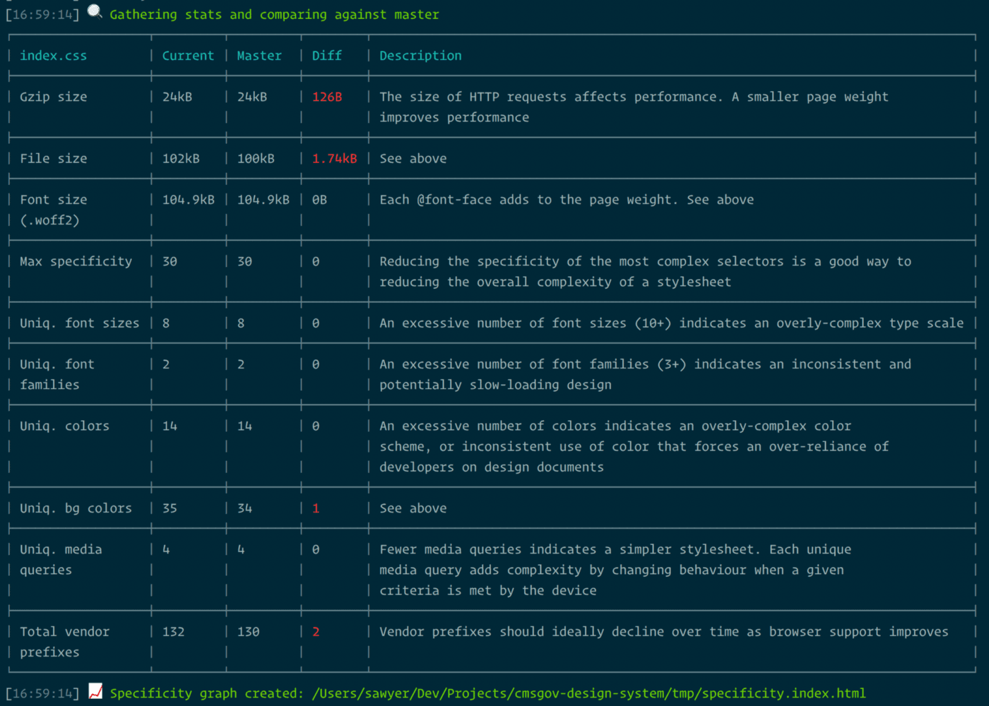
CSS stats output during the build process.
Another part of the stats output is a specificity graph, which helps us visualize the CSS’s complexity and structure:
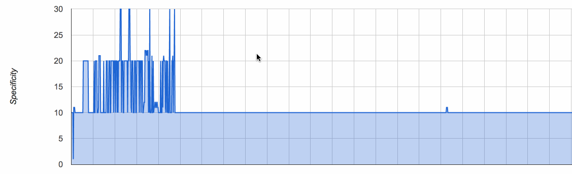
The design system’s specificity graph.
Distribution
Multiple NPM packages
One of our goals for the design system is to make it easy for teams to pick and choose just the parts they need for their project. That’s one reason why we’re using a modular CSS architecture, having each component or utility in its own file. This also led us to break the design system down into multiple NPM packages. We currently have three:
A core package contains the bulk of things, like CSS and React components, utility classes, and fonts. In the future, we might break these out into more granular packages, but the “core” package will remain as a convenient way to install a bunch of things at once.
A layout package contains the Flexbox grid framework. This is installed separately since some teams might prefer another grid framework, or need to support older versions of IE.
A support package contains the design system’s Sass variables, mixins, and functions. This is used internally as a way to share these pieces between all the packages. It’s also available for other teams in case they’d prefer writing their own Sass declarations.
Shoutout to GitHub Primer, which takes this multiple packages idea to another level.
Monorepo
Though the design system is broken down into multiple packages, everything is managed as a monorepo—everything in a single GitHub repo. This provides some nice things, like:
Tooling can live in a central location and be shared across all packages. This means there’s a single linting, testing, and build process for all of the packages and the documentation site.
Local development is simplified: npm start
Easier dependency management. Lerna is a great tool for managing a monorepo. With a single command it installs each package’s dependencies and links any cross-dependencies: lerna bootstrap
Versioning
Like most NPM packages, the design system follows Semantic Versioning (SemVer). A tricky thing we encountered is that Semantic Versioning defines rules for versioning software, where minor, major, and breaking changes is pretty apparent. In the context of a design system, where there are visual components, these distinctions are less clear.
What we ended up settling on was this SemVer interpretation by Daniel O'Connor:
Patch release: Bug fixes and other minor changes.
Example changes:
Backwards compatible Sass bug fixes
Tiny visual changes to make the UI more consistent
Minor release: Backwards compatible new functionality, newly deprecated APIs, or substantial new functionality/improvements to private code.
Example changes:
Addition of a new component
New classes, global variables, mixins, functions, or deprecated code
Minor visual changes to existing components
Major release: Changes which break backwards compatibility.
Example changes:
Renamed or removed classes, mixins, functions, or global variables.
Major visual changes to existing components
Future work
Besides continuing to grow the design system itself as we identify user needs, there are additional pieces we’re hoping to add to our toolbox soon. We already have Sass and JS linting and unit tests setup, but our automated tests can be taken up another notch.
We’d like to introduce visual regression testing so we can more easily track visual changes. We’re excited to experiment with Puppeteer, a Node library which provides a high-level API to control headless Chrome.
Though tooling alone can’t catch every accessibility issue, they’re still helpful for catching issues. React-axe, axe-core, and Lighthouse are some tools we’re investigating for helping automate some of our accessibility and performance audits.
Using it today
The design system is open source and available today. Visit the documentation at design.cms.gov to learn more about using it, or check out the code on GitHub.
Written by

UX Designer, Frontend Developer