Design systems provide a foundation of common design patterns and guidance. They help teams build consistent experiences that are easier for people to use. When it comes to building government systems, using the U.S. Web Design System (USWDS) is a repeatable, sustainable process that lets teams save time for more complex issues. As we wrote:
We’re building complex systems under tight deadlines and budgets. Adopting and leveraging proven patterns gives us more space to focus on areas of complexity — nuanced community needs, policy requirements, staff operations, launch strategies — without burning out our teams.
USWDS is a flexible foundation
Design systems save teams from reinventing the wheel, and yet, there are so many separate design systems at the federal, state, and local levels. Some reasons for this might be:
Siloed development: Work happened in parallel, when design systems within government were becoming more common.
Technical limitations: Other design systems require use of an unfamiliar technology, or they're not maintained at the desired level.
"Not invented here" syndrome: Teams are often biased towards not using standards from external origins.
Design constraints: Other design systems have a specific visual identity that doesn't match yours, or is lacking design patterns your project needs.
Most of these reasons are historical. If you're debating whether to create a design system from scratch today for your government sites, you should consider using the U.S. Web Design System (USWDS) as the foundation. You’ll be able to focus finite resources elsewhere. The reasons listed above don't apply to the USWDS.
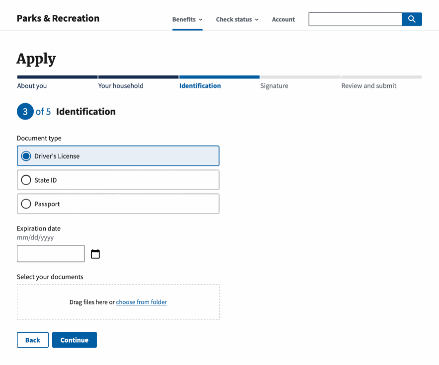
The USWDS includes the design patterns most government websites need. Usage documentation is robust. Components are Section 508 compliant and informed by research. And there's adoption options for projects at various maturity levels.
The USWDS can be adopted into existing sites, without additional configuration. Framework-agnostic, production-ready CSS and JS are available for download. This means you can immediately drop these files into your site and begin prototyping.
The USWDS is trusted by over 100 government sites. It's part of General Services Administration’s (GSA) Technology Transformation Services, maintained by the Office of Solutions. It includes full-time contributors, and contributions from community members like Nava, actively maintaining and improving the system in the open.
The USWDS can be themed. This means you can customize settings like color, typography, and spacing in order to make it match your existing brand's visual identity.
Adapt USWDS to match your brand’s visual identity
This last point may have flown a little too far under the radar, so let’s talk about what theming looks like in practice.
Let’s get familiar with three areas related to theming:
Design tokens
Settings
Extending
Using design tokens
Design tokens can be thought of as the ingredients of a brand's visual identity. Just as substituting ingredients in a meal results in different taste profiles, the same applies to swapping design tokens. Minor adjustments lead to different visual identities.
Each design token has a name. Designers and developers can reference colors, type styles, and spacing units by that name rather than a raw value. For example, depending on the project, a type size token named "XL" can map to a different size, or a color token named "primary" can map to a different color. Tokens are abstractions to support flexibility and communication. The underlying values can be changed while the name at the surface remains the same.
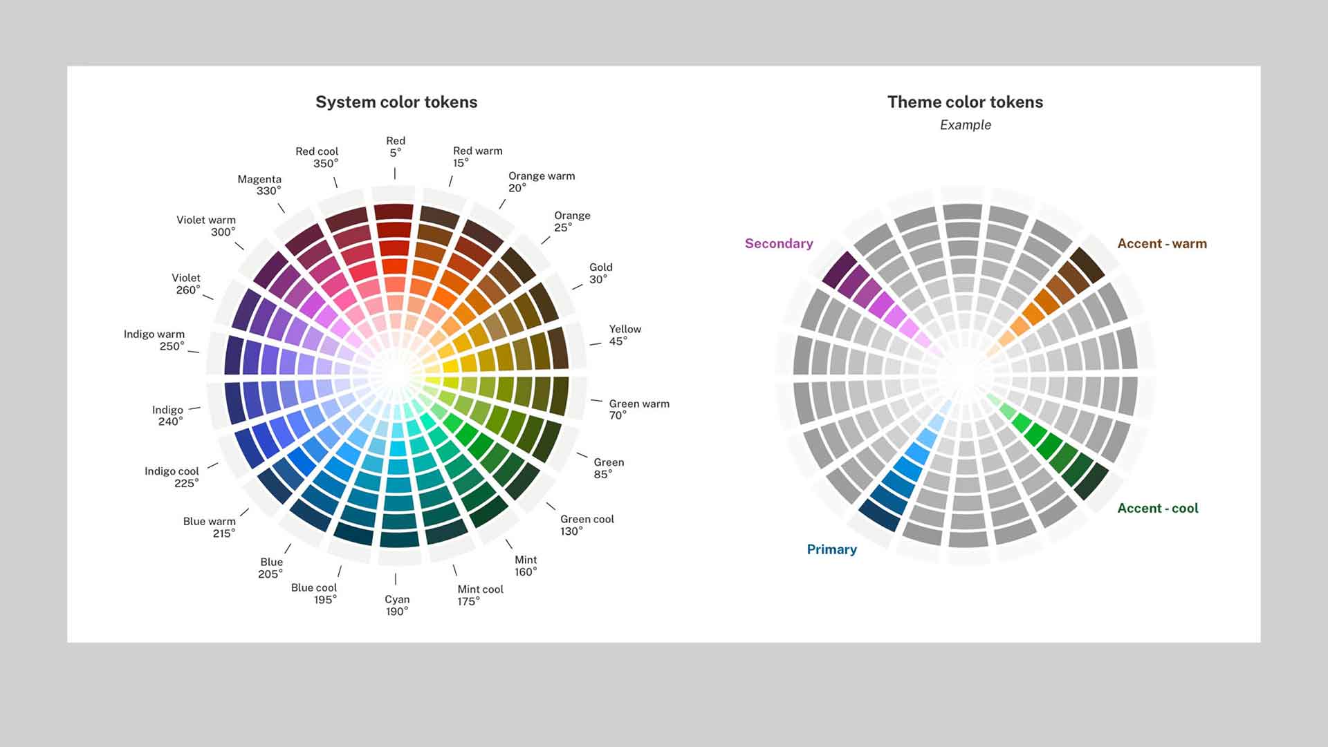
Within USWDS there are different tiers: system tokens and theme tokens. System tokens are well-researched starting points you can use (or ignore) to define your theme tokens, which represents your site's visual identity. As an example, USWDS provides a comprehensive set of 24 color families as part of its system color tokens. You can pull from this palette to form your site's color scheme. Individual USWDS components then reflect the theme's tokens in their appearance.
You also have the option to set your own raw values for theme tokens, which we'll discuss in the next section. However, when possible, you should try to use the system tokens USWDS provides. A lot of thought has gone into their selections.
For example, the USWDS system color tokens include numbers as part of each name, like blue-60, blue-50, etc. These numbers represent the color grade (0–100), and calculating the difference between two color grades can quickly tell you whether the color pairing is accessible and Section 508 compliant. The difference in grade between two colors is referred to by USWDS as the "magic number." A magic number of 50+ (e.g the difference between blue-60 and gray-10) means the color contrast ratio is at least Section 508 AA compliant. You can read more about color accessibility in the USWDS documentation.
Using settings
Let’s say that the city, state, or federal agency you’re working with has an existing visual identity that they want to preserve. Using the out-of-box styling is the quickest and easiest way to use the USWDS design system, but it also supports overriding design tokens – or “theming.”
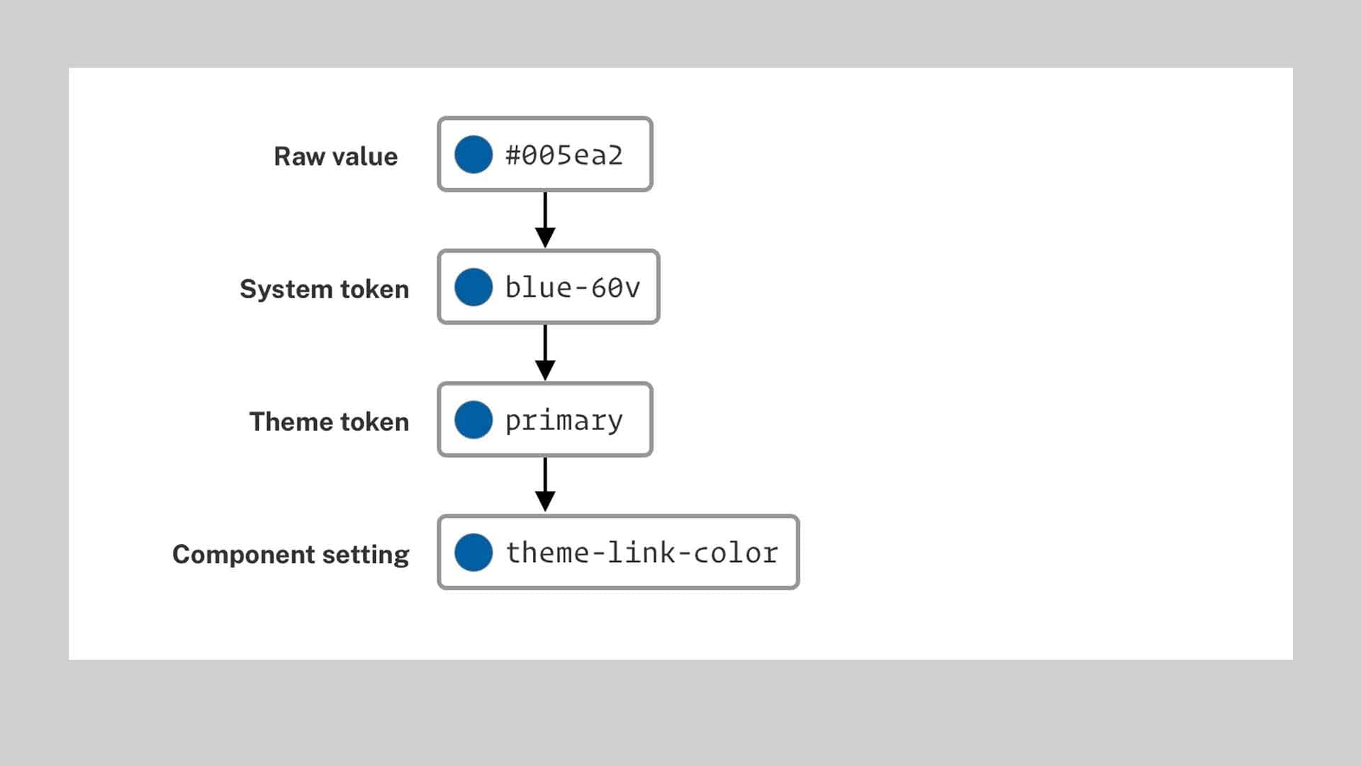
The default mapping of a design token, starting from a raw color value. Design tokens are then referenced by other tokens and component settings.
Continuing with the example from above, you could remap the "primary" color token to a different system token, or to another raw color value. These overrides are stored in settings variables.
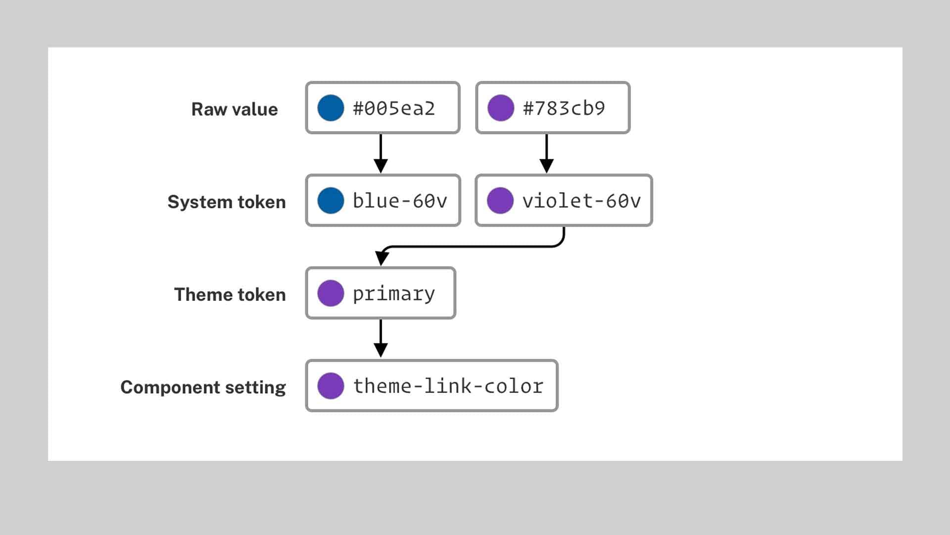
A token's mapping can be customized, which has downstream impacts on the components that reference it.
The code for mapping the "primary" color token to the Violet system color token would look like this:
$theme-color-primary: "violet-60v";
Mapping the "primary" color token to a raw color value would look like this:
$theme-color-primary: #ff0000;
Similarly, you can override component-level settings, remapping them to different tokens or raw values.
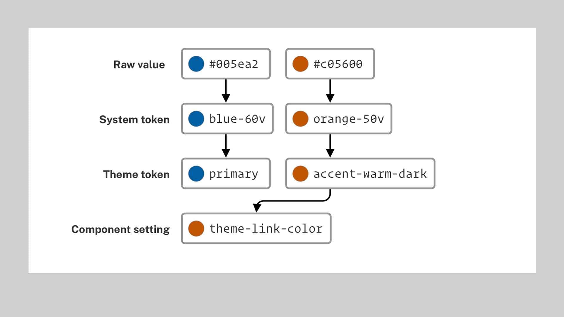
Individual component settings can point to other tokens or raw values for more granular control of a design identity.
For example, remapping the link color to a different theme token would look like this:
$theme-link-color: "accent-warm-dark";
Beyond colors, you can adjust the settings for spacing, typography, border radius, responsiveness, and other component-level design details.
As a very simple example, here's a demonstration of three different configurations for just four design tokens, using values that USWDS provides out of the box for colors and typography:
$theme-color-primary
$theme-font-role-heading
$theme-font-role-ui
$theme-font-type-sans
Using three different configurations, for just four design tokens, from values that USWDS provides out of the box for colors and typography, yields this variety of visual experiences.
If your iconography or typography are essential to your visual identity, you can also bring over your own icon and font files. For font files, check out the documentation for $theme-typeface-tokens. For icon files, you can use the same file names as the USWDS icons you want to replace.
The outcome of using these design tokens, utilities, and components is ultimately up to your team. Your skills will inform your ability to achieve the desired visual identity and user experience. It's also extra important to ensure any style overrides you define remain Section 508 compliant across the system.
Extending the system
If the USWDS is missing a component you need, or a settings variable isn't available for the thing you want to theme, you have a couple options.
First, USWDS is open source and open to contributions, either as pull requests or feature requests to prompt discussion. You can find their contributing guidelines here. From my experience, they’re very responsive to contributions.
And if you need something ASAP, you still have the option to write custom code. Within the code, you should reference design tokens where possible, so that your styles are pulling from the same source of truth, remain maintainable, and don't introduce design inconsistencies. The USWDS provides a variety of options for referencing tokens in code, ranging from variables, functions, mixins, or utility classes.
With your theme settings configured and any custom code created, you can then distribute this "child design system" so other projects can use it, all while using the USWDS as the foundation.
Other opportunities to use USWDS
The main takeaway is that your team doesn't need to create a design system from scratch. There are plenty of unsolved challenges that teams can focus on instead to improve government services. There are areas tangential to USWDS that haven't had as much love and attention, like:
Framework adaptations
The tech ecosystem shifts so quickly that it makes sense that the USWDS focuses on delivering standard CSS and JS. However, teams still want to use their favorite frameworks, whether that's Drupal, React, or whatever trends next. Teams can support the USWDS by open sourcing their framework-specific libraries, like ReactUSWDS, which provides React developers with a more convenient way to render USWDS markup.
There's also opportunity for teams to contribute tooling around the USWDS. For instance, the USWDS Color Tool helps match custom colors to colors that are defined within the USWDS. I've also experimented with what a USWDS theme builder might look like.
Open source form builders
Government forms are complex, often branching across many pages. The USDS explored creating a U.S. Forms System, which the City of Austin is still building off of. The USDS team documented their learnings for the next team to pick up. There are similar form builder initiatives in the UK, Canada, and Singapore.
Making it quicker and more affordable to improve government forms with accessible form design patterns would go a long way. As Cyd Harrell writes in "A Civic Technologist's Practice Guide:"
An enormous number of interactions with government, certainly with executive-branch agencies or courts, involve filling out a form—and most of these forms are confusing, hard to read, and repetitive. Granted, it’s not the cutting edge of software innovation—but improving forms, either by better designing paper ones or creating great, accessible, mobile-capable web ones, can be a significant boost to people’s direct experience with government.
Platforms
Government sites share common technical requirements, like hosting, authentication, notifications, and payments. Platforms can make it easier to deliver individual projects more effectively. These are becoming more common, evidenced by platforms like cloud.gov, in the US, X-Road in Estonia, or GOV.UK Notify, which was later repurposed in Canada.
Rather than creating a new design system, the areas above are potential focus areas for teams looking to improve government services and the ways we build them. There are certainly other areas that are important too. In the process, the USWDS is available to play its part in supporting the design and implementation of accessible, user-friendly experiences.
If you’d like to learn more about design tokens in general, check out this explainer video from Jina Anne, the concept-creator of design tokens.
Written by

UX Designer, Frontend Developer