Back in 2018, we wrote about our approach to designing and building the eligibility application for HealthCare.gov. Working on the HealthCare.gov application taught us both how to document complex policy regulations, sequence questions and collect information according to individual situations, and develop standardized, repeatable design patterns — and how important these processes are to building benefits systems. Since then, we've had the opportunity to take our practices and apply them to online benefit applications in Vermont and Massachusetts.
Part of our responsibility is to identify what's most useful for people — especially those experiencing stress or crisis — and how we can address those needs thoughtfully and efficiently. This is often urgent work. To ensure we’re working sustainably, we've reused, expanded, and iterated on practices that help collaborative teams thrive while quickly and effectively meeting people’s needs. We want to share what's worked for us and also welcome best practices and processes from other teams solving similar challenges.
Foster collaboration across roles and teams
First, one of our key principles is to be intentional about sharing information and collaborating across teams—including design, engineering, product, and policy. In our work on public benefits systems, we've found that alignment in the following areas are especially key:
Information sharing and communication
Translating and socializing policy regulations
Explaining technical constraints
Establishing and enforcing shared language between design and engineering
Collaboration
Pairing, reviewing work, iterating, shipping
Biasing toward existing components, design patterns, and code
Prioritizing what's good enough for now and deprioritizing the rest
Designers and engineers on the team are responsible for holding each other accountable. We have to make sure we're not adding unnecessary complexity or accidentally introducing changes that will impact other parts of the service.
Start with a design system
A design system is a set of common patterns, components, and practices used to provide a consistent experience for the end users. Using a shared design system for digital services enables our teams to move quickly to deliver the best solution for our users because usage guidance is embedded in the system. We typically recommend that our government partners adopt the US Web Design System (USWDS) because it's an open source library of code, tools, and guidance maintained by the federal government (GSA). Additionally, USWDS has been vetted. It’s used by nearly 200 federal websites and even more state websites for accessible, mobile-friendly experiences.
Starting with a design system gives us a solid foundation to build from. It allows us to focus our early work around the aspects of the project that are unique, like the policies, people, and operations, rather than the parts that are typically the same across projects, like the patterns of application forms.
In order to deliver something useful to people quickly it's important to lean on the elements that already exist within the design system as much as possible. When we introduce a new design pattern, it impacts the entire team's capacity. It takes design time to conceptualize; it takes an engineer's time to implement; it takes another engineer's time to review; and the changes need to be reviewed for quality assurance. Because of all of this, it's important for everyone to ask:
Does this pattern already exist in the system?
Is this change needed in order to meet the business requirements?
Or is this a system-level change that can be prioritized separately from the feature work?
Formalize shared language
Shared language is critical, and tricky to get right. As one example, miscommunication between designers and engineers can creep in when style and semantics are mixed together. Sometimes a designer communicates in “style” and refers to an element as a “heading.” But an engineer might hear “semantics” and assume that “heading” means “<h2>”. The two aren't always the same and depend on the context. For example, a group of form fields are semantically labelled with a “legend“ element, but a designer may be looking for that text to be styled as a Heading 2. It's important for design artifacts to be clear in what's being communicated — is it the style, semantics, or mix of both? Aligning on what is communicated and how is important for all roles and teams: designers, engineers, policy, and program people.
Align on policy interpretation and approval
Implementing policy regulations correctly is crucial to ensuring that a benefits system is both usable and compliant. Policy and program experts should be embedded on the team from the start so that everyone understands the vision and scope of the project. When working with policy and program experts, we’ve found that it's important to align on:
Decide when to rely on synchronous or asynchronous feedback. For example, specify how often teams will meet, what artifacts will be used for reviewing and commenting, and when people should provide feedback on their own time instead of all together.
Articulate guidelines for feedback. For example, let reviewers know whether they should focus on policy accuracy and when they should focus on style and editorial copy.
Align on sign-offs and approvals. For example, this application question or content is correct enough to start implementing. Further updates can be iterated on in code or prioritized for after launch.
Don’t reinvent the wheel to solve common problems
Many of the problems to be solved across different benefits projects are similar. And a lot of work has already been done to address these problems — they’re not new. Relying on the existing knowledge and processes to address them lets us work quickly and focus more time and resources on the problems that are unique to a particular benefits system.
Identify opportunities for templates
An eligibility application is a series of questions (oftentimes a lot of questions) used to determine if you qualify for support, and if so, the type and amount you can get. Put simply, the basic pattern is the repeating combination of question and answer, question and answer, question and answer.
In an online application, these question and answer screens are not that different visually from screen to screen. So, creating design mockups of every single question screen in the application isn’t an effective use of time. Instead, designers and engineers collaborated on a Question Page Template. The template standardizes the general structure and visual hierarchy of a question page, and the terms we'd use to talk about the various pieces of the page. This lets us work through all of the question screens — the majority of the application — efficiently and effectively.
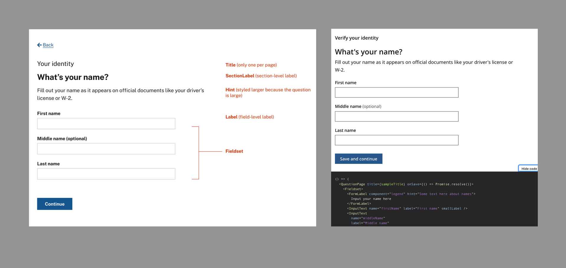
Design and engineering annotated each element with the terms everyone would use when communicating about it, respectively, in Figma, on the left, and in Storybook, on the right.
Our design of the question page template — and the idea to slice the application up into multiple pages — was based on foundational research from the Government Digital Services team in the UK. Much like the USWDS team, the GOV.UK design system team has built, tested, and published components and patterns that work for their digital services. We often use their research as another resource in order to avoid reinventing the wheel.
As we were creating the template, design and engineering annotated each element with the terms everyone would use when communicating about it. This template then got translated into code and added to our Storybook, an open source tool for building and documenting UI components.
A tool like Storybook serves as a source of truth and shared reference point for our projects. This helps with everything from fostering productive conversations in other places (in meetings, on chat apps) to helping us design end-to-end question flows. We’ve used Storybook as the source of truth for what components (e.g. form field) and patterns (groups of components, e.g. a Review page) are used on a state's benefits application. Designers and engineers on the project can more easily understand what components are available, what props they use, how they've been applied, and what guidance to follow.
Use the same tools to solve the same problems
In our work on public benefits applications, we've aligned on a set of tools that we use to address common problems. For example:
To establish reusable templates for common patterns, we use code.
To figure out the flow and conditional logic for a set of questions in the application, we use a question protocol like Lucidchart.
To create a new component or pattern (only when the design system doesn't have something that will work for this project), we use a high-fidelity mock-up like Figma.
To communicate content and structure for non-question-pages, when we have existing patterns to reference, we use tables or docs like Confluence or GSuite.
Use a question protocol to diagram the flow and conditional logic for a set of questions
A question protocol is a diagram used to document questions in your application, with documentation to explain business logic and implementation details.
Through our work on public benefit applications, we've found that a "one-thing-per-page" design principle works well for people because it results in a simpler user experience. This translates to generally displaying one question per application page. Using the question page template, designers use Lucidchart, a cloud-based diagramming application, to diagram all of the application question flows, beginning to end, in order to figure out the sequence and conditional logic.
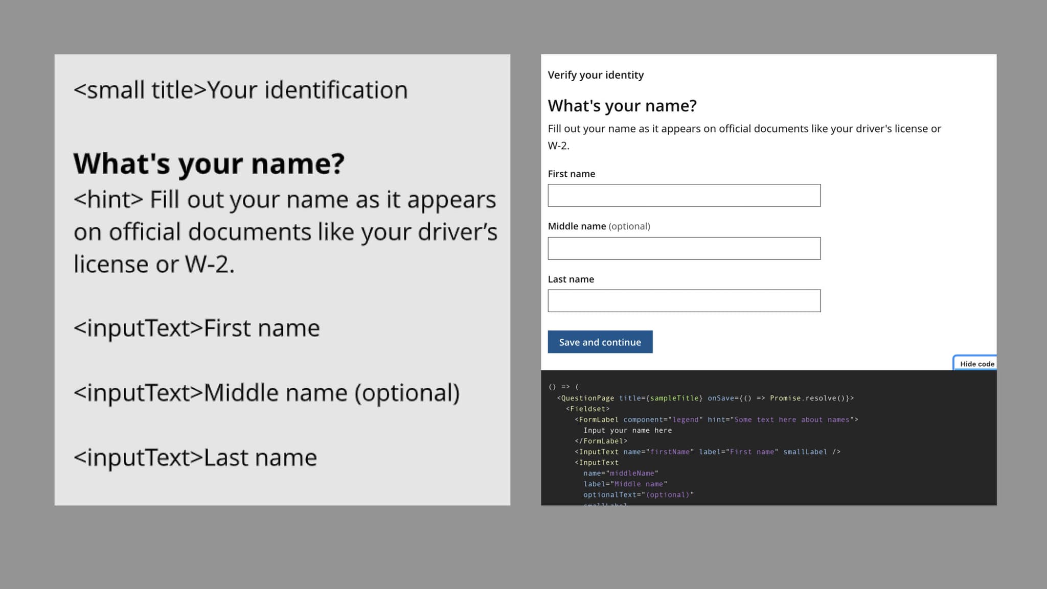
Lucidchart lets us document the business and policy requirements for every question. Here's how our Question Page Template appears in Lucidchart, on the left, and in code, on the right.
Using Lucidchart to document application questions is a practice we expanded on after our work on HealthCare.gov. Lucidchart lets us document the business and policy requirements per question. We've used these Lucidchart diagrams with policy teams and other stakeholders to clarify regulations and validate that we're correctly asking questions and collecting information. We also include implementation details like components to use and validation rules. Engineers reference the Lucidchart files when building out questions and flows.
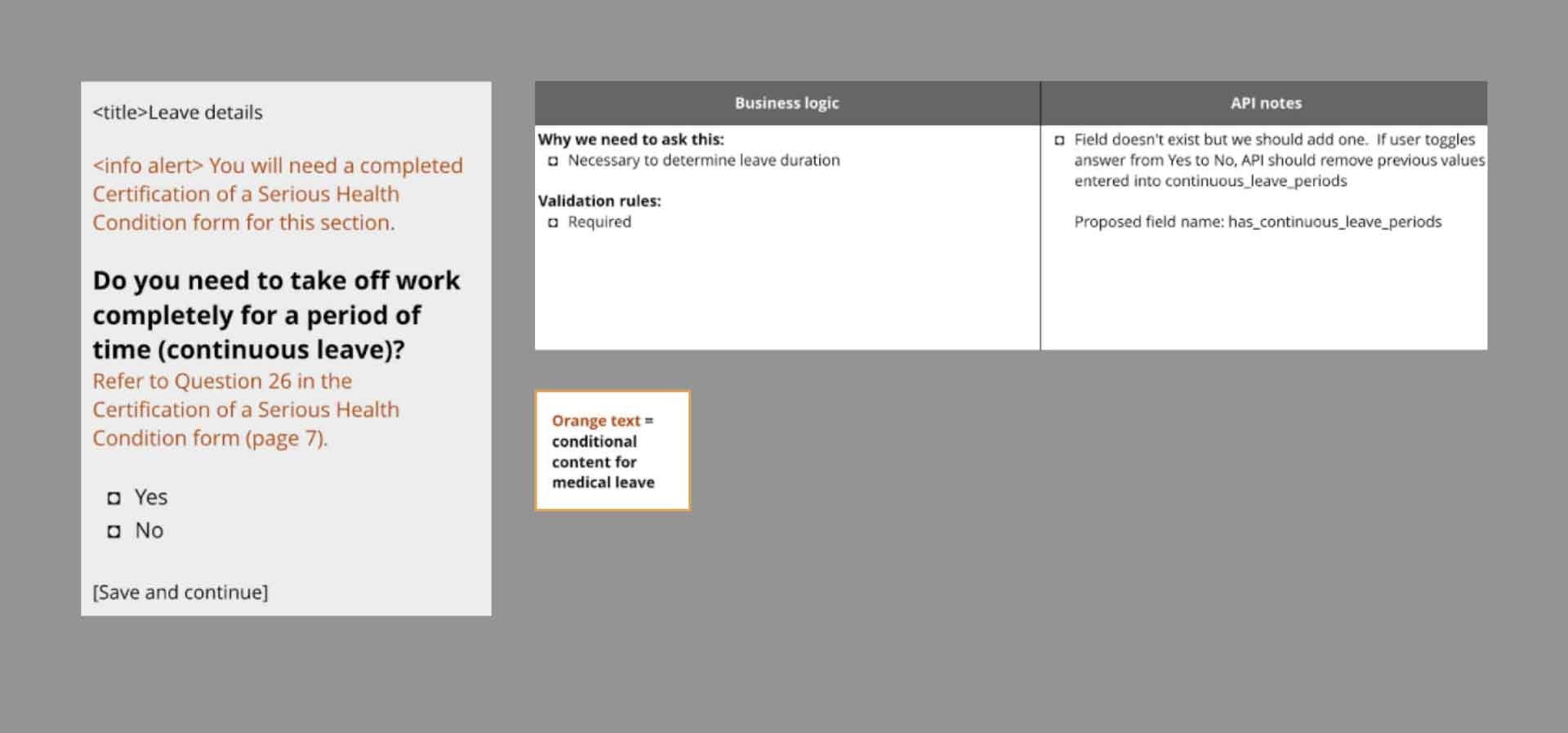
Our templates also document business logic, in addition to implementation details.
This workflow helped to maximize our collaboration and expedite our work because we could focus on content, sequencing, and conditional logic. The visual design details were already handled by our Question Page Template and didn’t slow down this phase of work.
Create high-fidelity mockups for new components and patterns as needed
If the design system doesn’t have a component that’s appropriate for what we need, then we design and iterate on a new component or pattern using a design tool like Figma.
There’s a lot more to an online public benefits application than the question pages. Internally, we refer to these as "non-question-pages." Examples include something like a "Review page", where applicants can check their answers before submitting the application, or a "Confirmation page" that communicates that the application was submitted and what comes next.
In addition, a public benefits application is often a multi-step process that requires applicants to provide a lot of information. We know from research that applicants might not be able to get through the entire application in a single session (for example, they might need to go to a doctor's office to get medical documentation). We wanted to introduce a pattern that would let applicants know where they are in the process and easily resume if they had to step away. There wasn't a pattern that could really accomplish this in the USWDS design system, but this was a problem that our HealthCare.gov team solved through a pattern called the Step List, inspired by the Task list page in the GOV.UK design system. We decided that we could extend their pattern for our application and context.
To ensure the new work we did could be reused, design and engineers collaborated to build our updated version of the Step List. We created a high-fidelity version of the Step List in Figma to clarify to engineers the different states each step could be in. Including details about the states not only made our work more efficient — because it minimized back and forth between design and engineering — but also makes it easier for future teams to use the updated version.
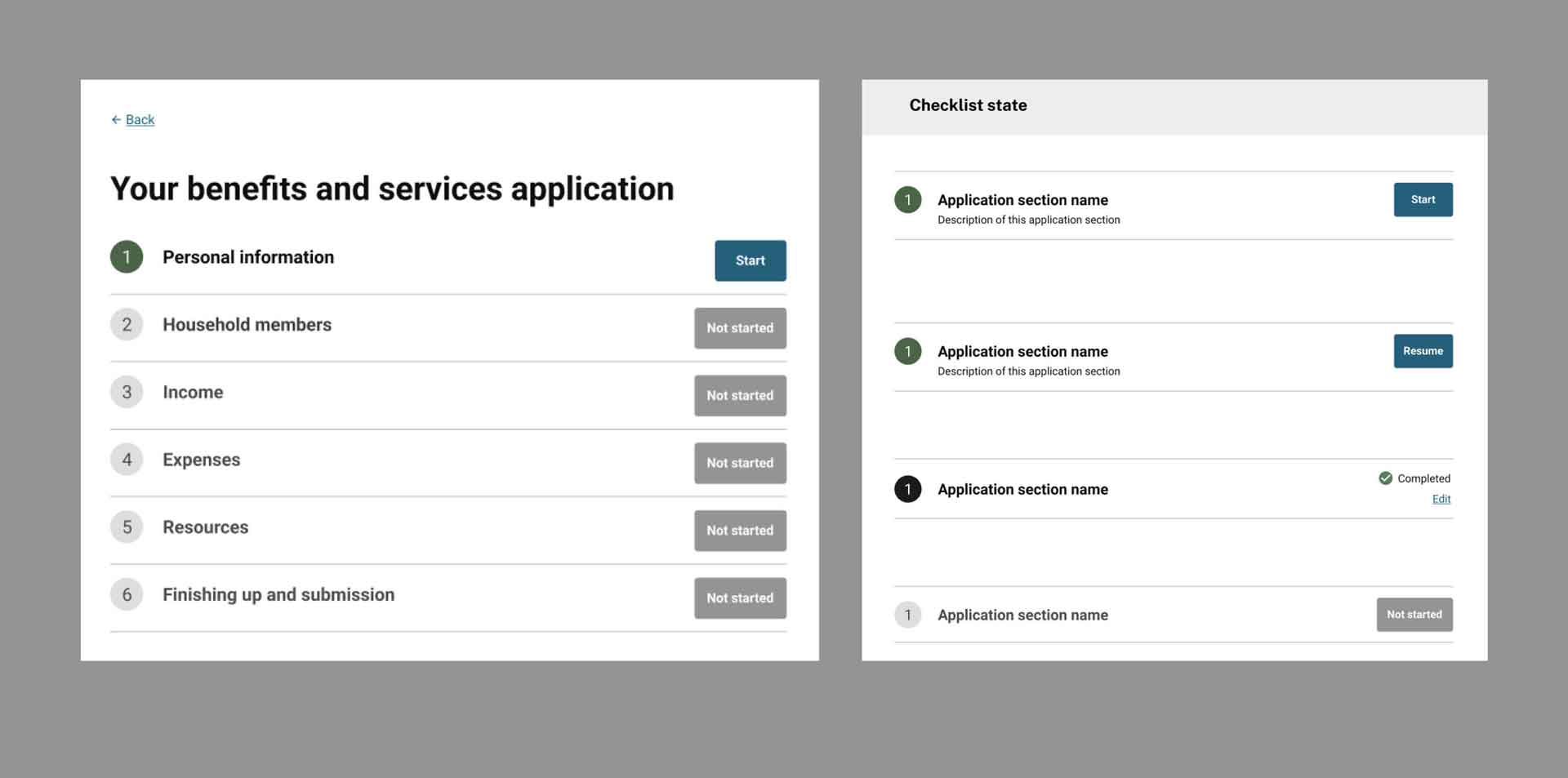
An updated version of the Step List helped ensure the new work we did could be reused. Including details about the states made our work more efficient and makes it easier for future teams to use the updated version.
Communicate content and structure for non-question-pages, when we have existing patterns to reference
Sometimes we’re designing using an existing pattern that doesn't translate well into LucidChart, which is best when we're trying to show different routes and branching logic. We've found that other tools like Confluence or Google Docs can be useful for communicating design work to engineers when we mainly want to map content to existing design patterns.
Below is an example where we use Confluence to communicate design work: our error messages in the application follow the same pattern), so it didn't make sense for us to mock up every single error message in a tool like Figma. Instead, we created a table in Confluence with every possible error trigger on a page and what the corresponding error message should be. This was a much faster process that allowed the team to focus on what errors were even feasible based on the backend system that the application sent data to.
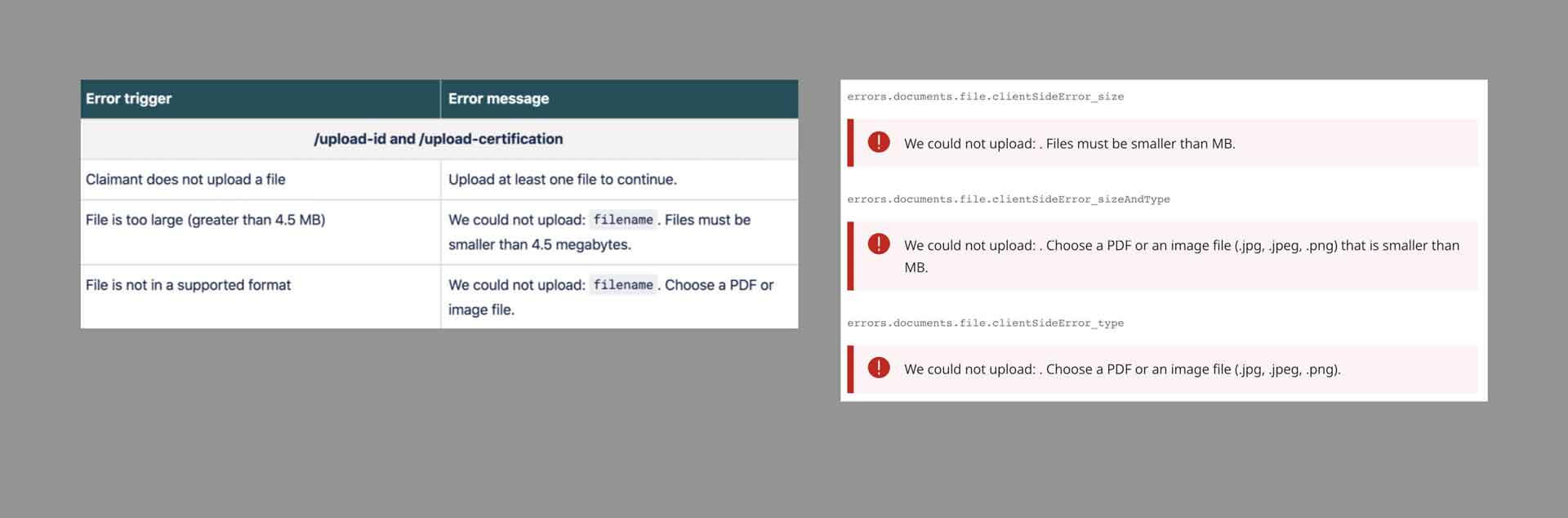
Templates for error messages include the messages, how they're triggered, how they're styled, and how they're displayed to end users.
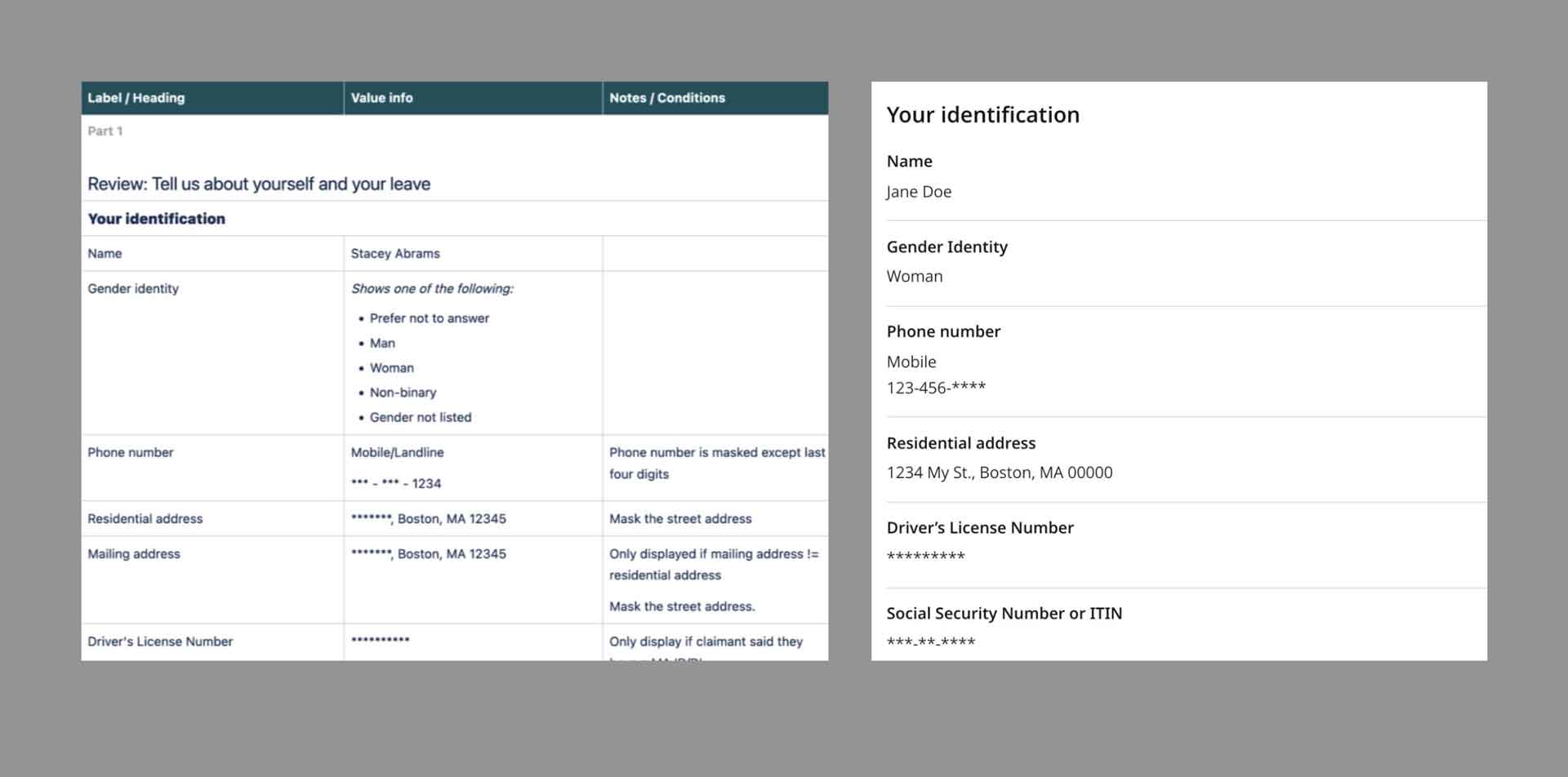
Implementation details for data that could be displayed on a "Review page," where applicants can check their answers before submitting their application are document in the table on the left. The image on the right shows how the "Review page" is styled for applicants.
Make critical work more sustainable
Implementing benefits systems is critical work. We’re building complex systems under tight deadlines and budgets. Adopting and leveraging proven patterns gives us more space to focus on areas of complexity — nuanced community needs, policy requirements, staff operations, launch strategies — without burning out our teams.
After working on Healthcare.gov, and in states like Massachusetts and Vermont, we know that these practices can help efficiently, effectively, and sustainably build benefits systems that meet people’s needs.
Written by

Senior Designer/Researcher

Senior Designer/Researcher

UX Designer, Frontend Developer