In government, eligibility applications are used to determine whether a person or group of people can access something. This something could be a scholarship, citizenship, free or reduced lunch, or any service the government offers because of a policy or law. These applications can range from very simple (e.g. “Is your household income below X amount?”) to very complex.
Nava PBC had the challenge of determining how to structure the complex eligibility application on HealthCare.gov, part of an oftentimes deeply personal process, one that will determine how they care for themselves and their family. At a high level, the HealthCare.gov eligibility application determines whether a person’s family is eligible for an insurance plan, and whether they’re eligible for any cost savings to make their insurance more affordable. In addition, the application determines whether a person is eligible for Medicaid or the Children’s Health Insurance Program (CHIP), programs which provide free or low-cost health coverage to millions of Americans. The application therefore determines whether or not people, both at the individual and household level, are eligible for a variety of programs and services. To make it even more complex, Medicaid and CHIP policies vary state-to-state.
This presented a challenge to our team: How might we design a simple and clear experience for a form that needs to handle many different family circumstances, and therefore the questions can vary widely? One way we approached this was by providing timely help and guidance to the applicant. Another way, discussed below, was in how we used different design patterns to break the application into digestible chunks of questions, simplifying the interface, and allowing the applicant to focus on smaller bits of information at a time.
Determining the overall sequence of questions
The first task the team had to tackle was determining what questions even needed to be asked. This isn’t as simple as it might seem. In order to do this, Nava’s design and product teams (special shoutout to David Myers and Domenic Fichera) needed to intimately understand the various policies that were driving the information required from applicants, and we worked closely with partners at the Center for Consumer Information and Insurance Oversight to do this.
Once we identified the questions we needed to ask and their corresponding policies, we created a massive flow chart, mapping the order of questions, conditions determining when a question is displayed, and any important policy context. In addition to the policy constraints, we defined several design principles to help shape the ordering of questions.
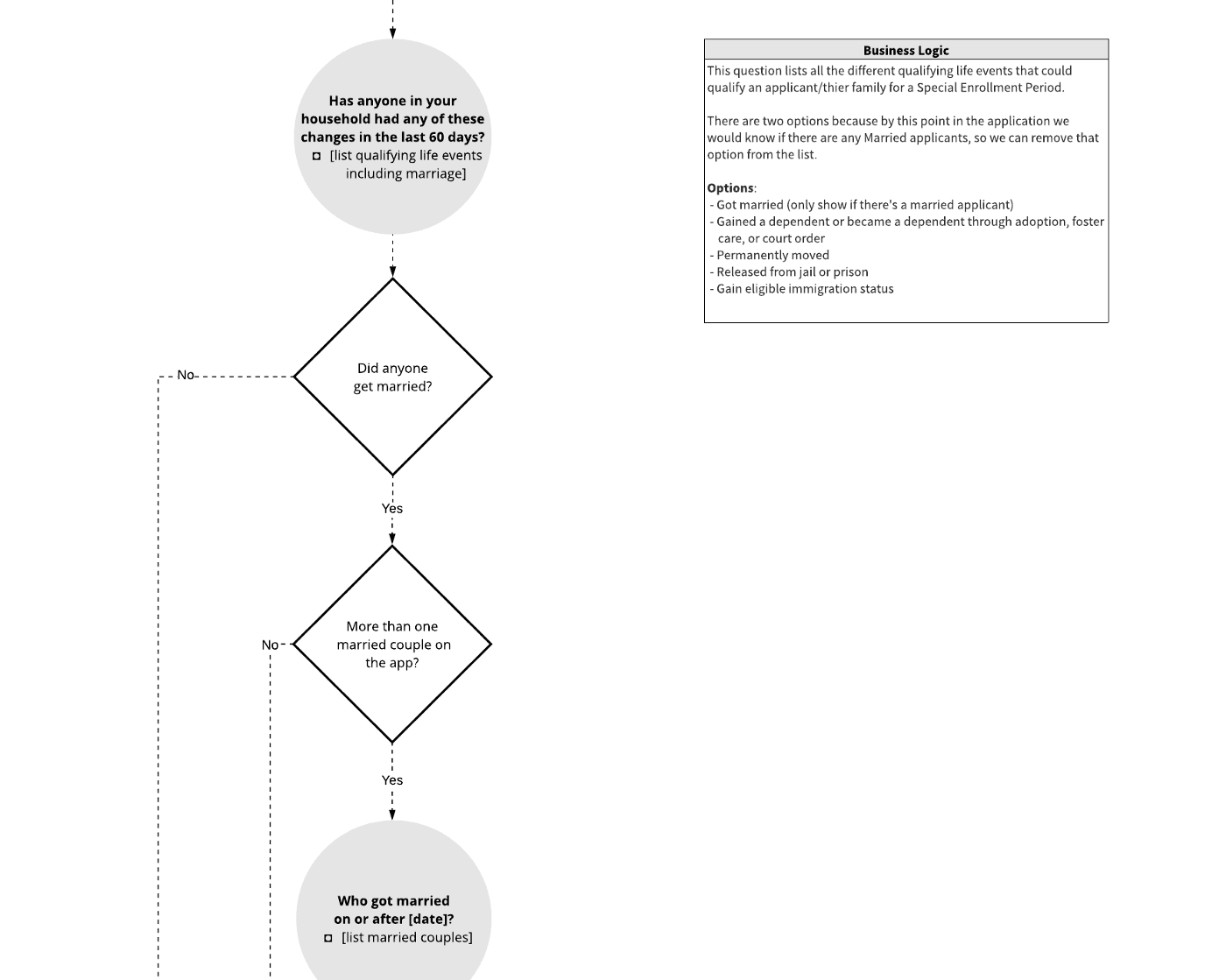
This is an example of a small slice of the flow chart showing the sequence, conditions, and business logics for all of the application’s questions.
The first of our design principles was to tailor to individual needs. Applying for health care is difficult enough without additional bloat. We aimed to give people the simplest application that matched their specific circumstances, rather than a one-size-fits-all solution. In practice, this meant only asking the questions absolutely necessary, providing the shortest possible path for each person. This sometimes meant introducing a broader “filter question” to understand whether a specific situation applies to anyone in the household. This would allow applicants to skip entire sets of questions if they answered the filter question a particular way.
You wouldn’t start a conversation by asking for sensitive details about a person — you’d first ask some basic questions that they’d be comfortable answering, like their name.
The second of our design principles was to minimize the effort needed to apply. A part of this is presenting questions in a logical and natural order. Thinking about the form we were designing as a conversation helped us with this. For example, you wouldn’t start a conversation by asking for sensitive details about a person — you’d first ask some basic questions that they’d be comfortable answering, like their name. Within conversations you flow from one topic to the next, and so we mimicked that in the form by grouping related information by topic. For example, rather than scattering questions about an applicant’s income throughout the application, we grouped all income-related questions into an Income section. (This might seem obvious, but it can be challenging to untangle multiple policies in order to group the information they’re looking for). In conversation, there are also natural pauses. We listened for these natural pauses in the questions we were asking, and this helped determine where white space could be introduced or where the form could be split into multiple pages.
Question sequencing design patterns
With these goals in mind, tailoring to individual needs and minimizing effort, we entered an exploratory phase where we researched and prototyped various question sequencing patterns. In the end, we landed on four main patterns:
One thing per page
Exposed within
Exposed after
Hub-and-spoke
One thing per page
Thinking of the form as a conversation leads you, the designer, to think of questions as groups of topics. Within topics, there are smaller groups of information that you’re gathering. For example, a topic could be a family member named Alex. While talking about Alex, you might cover things like their basic information (e.g. name, birthday) and then later discuss their health care history.
This is an example of limiting one piece of information to each page.
Inspired by form structure guidance published by GDS, we started by structuring the form across multiple pages with each page containing just one thing. A “thing” doesn’t mean a single field, and the majority of time it meant a small set of questions related to very specific pieces of information (e.g. “Alex’s income”). We thought of the guidance more as “One topic per page,” which we also found as useful framing when discussing the idea with stakeholders. We looked for the natural pauses in the conversation, and split the application’s questions across multiple pages when it made sense.
Some folks are hesitant when first encountering the idea of “one thing per page” because, as an industry, we’ve conditioned stakeholders and ourselves to think more clicks and more pages are a bad thing. This doesn’t have to be the case. Certainly, unnecessary clicks and unnecessary extra pages show lack of good design, but when pages are introduced thoughtfully in order to provide better pacing and guidance, the user experience benefits. We were fortunate to come across research from GOV.UK to help back us on this point:
We started with asking just one or two questions per screen, making it very manageable on mobiles. When we sent this early design around internally for comments, a common response was that it felt odd on large screens. […] However when we started user research with the general public, we saw a very positive response to the simple step by step approach, even on large screens. Though it added more clicks, people said it made the process feel simple and easy — there wasn’t too much to take in and process at any one time. So we stuck with the simpler screens for everyone.
Things we learnt designing ‘Register to vote’, GOV.UK
We’ve found that a surprisingly good approach, where received wisdom would lean towards more grouping. I’d rather users get bored than get stuck, and ‘one thing per page’ really helps low confidence users not get stuck. Things are easier to understand and focus on, and errors are more easily corrected, scrolling is kept to a minimum.
Joe Lanman, GOV.UK
Branching questions
After structuring the form across multiple pages, we still needed design patterns to help us surface questions, only when they were needed of course. We used branching questions, or conditional questions — if an applicant answers the question one way, they go down path A, if they answer it another way, they go down path B. The “one thing per page” pattern helps with this, but there are still times where a single page may have branching questions on it.
To handle these scenarios, we used two different patterns:
Exposed within
Exposed after
Exposed within
This is an example of an "exposed within" design for conditional questions.
The exposed within pattern typically takes the form of a set of radio options, which expose another field below a selected option. One benefit of this pattern is that the follow-up question is displayed within context, making it clear why the question is being asked.
In his book “Web Form Design,” Luke Wroblewski discussed usability testing research where users were presented with a form including this pattern. With eye-tracking and usability metrics set up, participants were asked “Please complete the form fully and accurately.”
In his research, the exposed within pattern was found to be the fastest solution tested and had the lowest number of average fixations — meaning the pattern required the lowest level of effort required to parse the form.
As you can probably anticipate, this pattern can backfire if not used thoughtfully. In the same research, Luke found:
If the number of selection-dependent inputs is substantial, this method breaks down quickly. The combination of page jumping and the movement of the initial set of options as the elements between them are revealed and hidden makes for a disorientating interaction that frequently has people questioning which user interface element triggers which set of options.
With this in mind, we constrained ourselves to only use the exposed within pattern when the exposed question was a single field. For everything else, we used the pattern discussed next.
Exposed after
The exposed after pattern is likely one most people are familiar with. This pattern reveals additional questions after a set of initial options. This pattern is useful when the follow-up questions require more than a single field, or are too information dense to be exposed within another option.
This is an example of an "exposed after" design for conditional questions.
A constraint we applied to this pattern was to limit the exposed questions to those that directly related to the current page’s topic. For other cases, the follow-up questions would be displayed on a separate page. Another constraint was to limit usage of the pattern to questions that follow the selection of a radio, checkbox, or menu option. This meant that questions are never exposed after an applicant types into a text field, which we found to be a potentially disorienting and jarring experience — almost like when someone tries to speak over you in conversation. Not polite.
Looping questions
Within the application there are topics — like family members and income sources — where we first need the applicant to indicate how many there are, loop through each one and answer the same set of questions. Once added, we then need functionality to support editing or removing the item. We explored a few design patterns to handle these “looping questions,” and found the most flexible to be a hub-and-spoke pattern. This pattern consists of a “hub,” a routing page where the applicant starts an action and returns after completing the action. And “spokes,” the various paths an applicant can take from the hub. We explored other options, like using a text field where the applicant could first indicate the number of items, or by placing repeatable “cards” all on the same screen. But for looping questions, the hub-and-spoke pattern provided space for the questions to live, without creating an overwhelming long-scroll form and gave clearer indicators of how to edit or remove an item.
These examples show two looping question sequences using the hub-and-spoke pattern.
One example of this pattern in action was in the income section of the application. In order to determine whether a household is eligible for help paying for coverage, the applicant needs to calculate their monthly and annual income. To help calculate this, the applicant enters all income sources (e.g. job, scholarship) and deductions (e.g. alimony) for everyone in their household. The income section had a hub for each person to add an income source, automatically return back to the hub, and then add other income sources or deductions before continuing to the next section.
Our recommendation is to track the completion rates of these hub-and-spoke sections and, in user research, observe how applicants use it to ensure the pattern and choice architecture supports applicant needs and avoids pogo-sticking or other pitfalls of the hub-and-spoke pattern.
Usability testing on the previous version of the application with new enrollees and re-enrollees found that we could “enhance the user experience and eliminate cognitive burden.” From applicants we heard, not surprisingly, that they are more likely to complete the form successfully (or at all) when we take on the burden of parsing policy and integrating the right tools and decision trees behind the scenes to route them to a lighter page with digestible chunks of questions relevant to their situation.
Our design principles were to tailor to individuals needs and minimize the effort needed to apply, and we believe the design patterns described above are steps in the right direction.
Additional reading
We were fortunate to come across a number of helpful resources while working on these patterns, and hopefully this post is a welcome contribution to the collection. Below are links to resources that helped shape this work:
Web Form Design, Luke Wroblewski
Form structure guidance, GOV.UK
Designing usable forms: the three-layer model of the form, Jane Matthews
This is part of a series of blog posts about Nava Public Benefit Corporation’s partnership with the Centers for Medicare and Medicaid Services to design and build a new eligibility application for millions of Americans seeking health coverage on HealthCare.gov. Read more in this series.
Special thanks to Jodi Leo, Zoe Blumenfeld, and the entire design team (Olivia Cheng, Susan Lin, and Kelli Ho) for helping put this together, and to the many dedicated civil servants who collaborated with us to improve the user experience over many years.
Written by

UX Designer, Frontend Developer